

LIVE
LIKE
MAD
bRAND design
Brand design for Live Like Mad, a social media strategies & systems expert who was looking for something timeless, classic, and very her.


Who is LIVE LIKE MAD?
Live Like Mad aims to provide their clients with the tools and systems needed to utilize strategies and social media as efficiently as possible.
When it came to the Live Like Mad brand, founder Madi was looking for something that felt classic and would be suitable for carrying her into the next few years of business.
We landed on four main visual guidelines:
Make the brand personable and approachable
Create something dynamic, lively, and unexpected
Utilize a neutral color palette with a pop
Get experimental with design elements


PROBLEM
The
Live Like Mad was lacking a solid brand strategy and visual foundation. Madi knew what she was picturing for her brand, but hadn’t yet executed it to create a cohesive system.

SOLUTION
The
We landed on a calming color palette consisting of neutral black, white, and beige paired with a serene blue. We added bright green, blue, and pink to contribute and unexpected pops.
For fonts, we went with a classic serif for a timeless look, but paired it with a handwritten script to bring in a layer of personality.


Brand PATTERNS


next up:
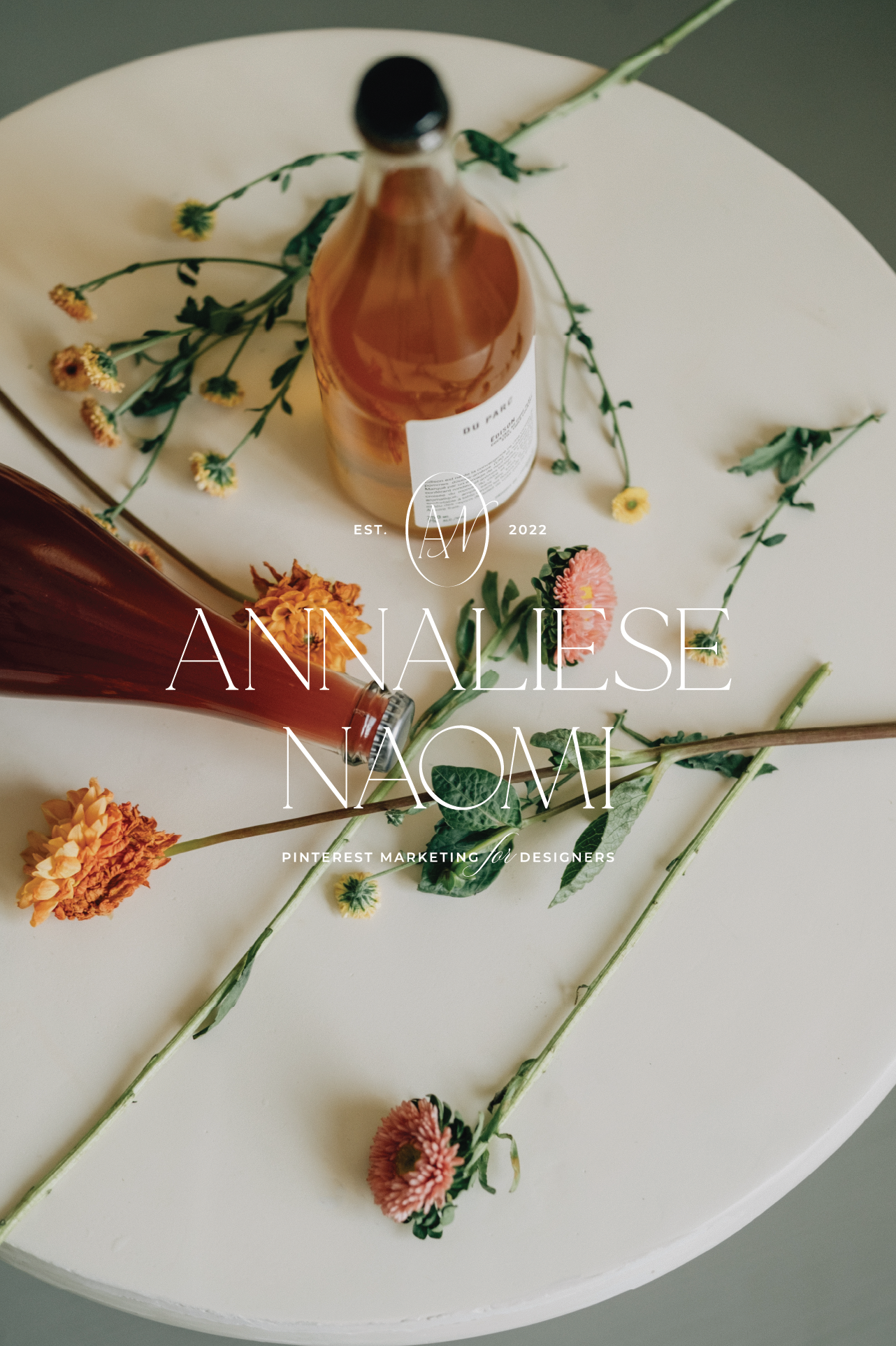
ANNALIESE NAOMI
Brand Design